3 Common UX Mistakes on Healthcare Websites—And How to Fix Them

In the healthcare world, digital frustration can be more than inconvenient—it can be critical. Patients aren’t just looking for information; they’re often stressed, short on time, or making important care decisions.
And yet, too many healthcare websites unintentionally create roadblocks instead of helping users get where they need to go.
Here are three of the most common UX mistakes we see—and what your team can do to solve them.
1. Cluttered Navigation
If your navigation feels like a maze, patients are going to get lost—and leave.
The Fix:
- Prioritize top user journeys (Find a Doctor, Schedule Appointment, Pay Bill)
- Use clear, patient-friendly language
- Limit top-level nav to 5–7 main categories
Clean navigation helps people get answers fast—without frustration.
2. Missing or Buried Search
Healthcare sites often contain thousands of pages. If search isn’t obvious—or doesn’t work well—users feel overwhelmed.
The Fix:
- Add a prominent search bar on every page
- Use autocomplete and filtered results
- Track search queries to improve results over time
Search isn’t a luxury. It’s the lifeline for patients in a hurry.
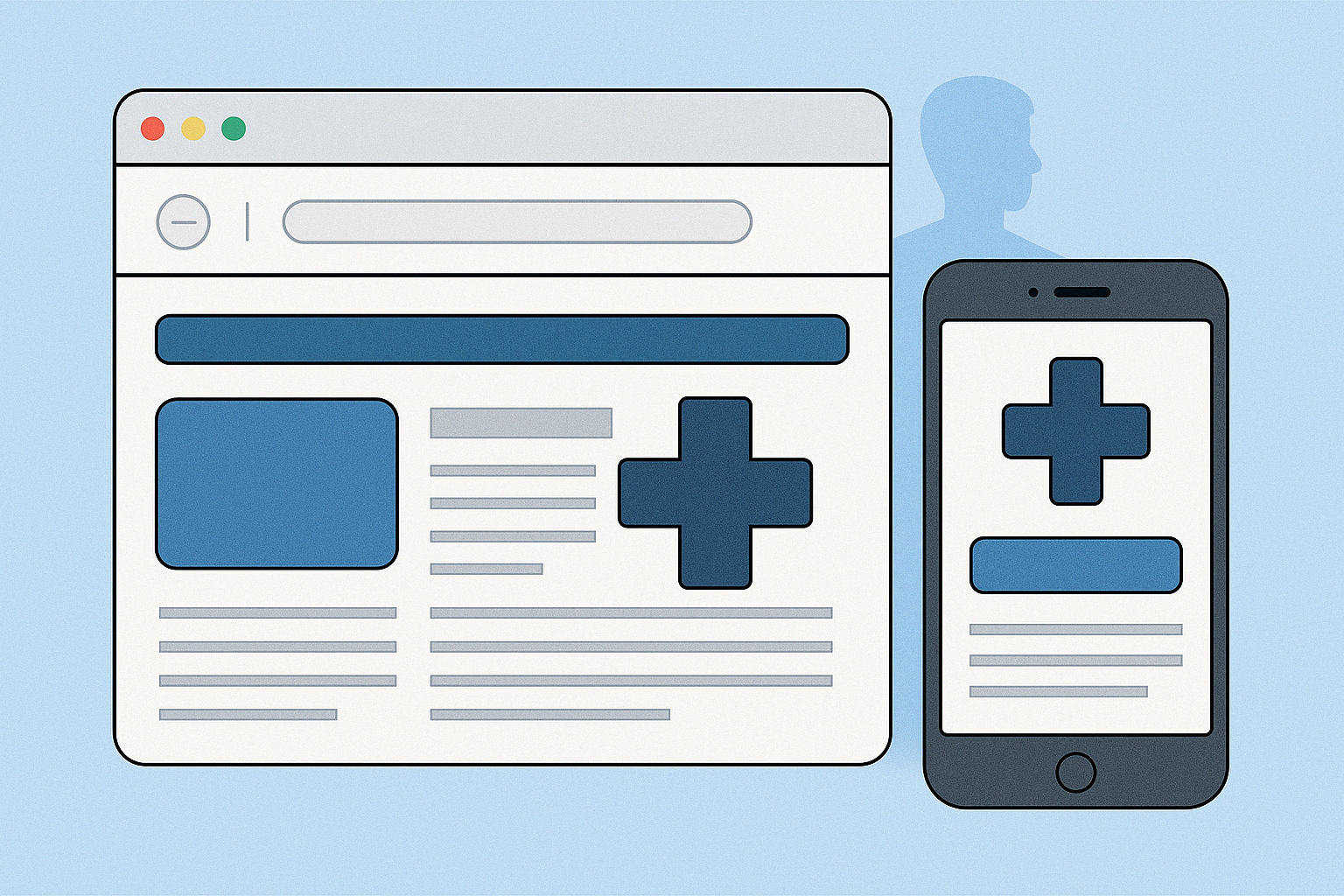
3. Mobile Experience is an Afterthought
Patients are browsing your site between appointments, in waiting rooms, or from their phones at work. If your mobile experience is clunky or inconsistent, you’re losing trust.
The Fix:
- Design mobile-first
- Use large touch targets and accessible font sizes
- Avoid pop-ups and click-heavy interfaces
A strong mobile UX is no longer optional—it's the standard.
Final Thoughts
Fixing UX isn’t about bells and whistles. It’s about making sure your digital front door is open, intuitive, and accessible to everyone.
At Alliance Innovations, we help healthcare organizations streamline their web experience so patients can focus on care—not confusion.
Let’s talk about how we can improve your UX: https://allianceinnovations.com/contact